SAP · B2B · 2012-2023
SAP Sapphire:
Unifying the Experience
SAP is an ERP software company headquartered in Germany. SAP Sapphire is their premier event that takes place in mid-May each year:
Globally syndicated across 100+ countries
Worldwide in-person experience event with thousands of attendees
Virtual experience with over 10K attendees.
Business Goal: Max Attendance for Pre, During and Post-Event states.
ROLE
Lead UX Designer
Lead Designer for the Events pod, owning the full pipeline:
Discovery (UX audit, competitive analysis, stakeholder workshops)
IA and wireframes (including a new AEM component for the experience-selector on the splash page)
Branding exploration (notably, the first real integration of SAP's Fiori product branding into the SAP.com web experience)
Hi-fidelity mockups across 5 breakpoints
(desktop, laptop, tablet portrait/landscape, mobile)Overseeing a graphic designer for image/video asset production
(~20 images through AEM DAM)Cross-platform implementation coordination across AEM, Rainfocus, and WEG teams
Final UAT management
Cross-functional scope: Collaborated with Experience Manager, Content, User Research, SAP Brand, Performance Manager, Platform Dev, plus an external agency (Freeman) for Rainfocus development.
SCOPE
Events Homepage
+ Pre + During + Post states
+ Session Catalog
+ Channels Page Overview
+ Live Stream
+ Virtual Session Catalog
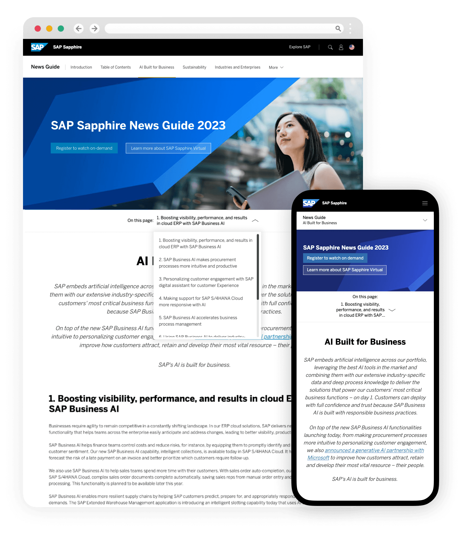
+ Sapphrie News Guide
A globally syndicated event (100+ countries) spanning three in-person locations (Orlando, Barcelona, São Paulo) plus a virtual experience with 10K+ attendees - all needing to feel like one unified experience across pre-, during-, and post-event states.
Timeframe: 9mo
CONTEXT
The problem
behind the project
The 2022 event was fragmented across three separate platforms (AEM, Rainfocus, WEG), each with its own URL, masthead, navigation, and visual language - causing user confusion, high bounce rates, and a messy registration flow. Classic "patchworked" problem, right in your wheelhouse.
Audience: Mainly SAP customers and partners, typically not new audiences. SAP super users also attend, looking to advance their career.
Outcome: Unified visual design/design system across all platforms → 4x visits/registrants and 3x attendees and post-event interactions versus the prior year.


01
Discovery • Define
Heuristic Evaluation + Competitive Analysis
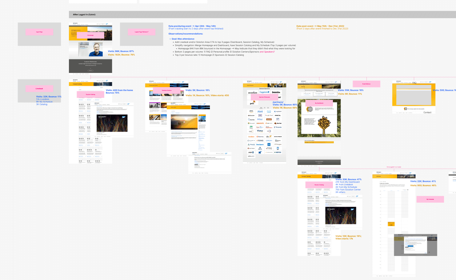
We began this phase with a UX Audit of the 2022 Sapphire site. This consisted documenting the existing page flow and analyzing key metrics to help us understand the problem space better.
Discovery also included a competitive analysis of the top industry events to keep up with any design trends or patterns.
Supporting documents that informed Discovery
Adobe Analytics
Workshop input from management and key stakeholders
Digital Event Strategy report from design agency
Interview Guide from design agency
Primary Research on Events
Requirements gathering from stakeholders and IT
CEM Personas
02
IA + Wireframes
Step 2: IA & Wireframes
We adapted the newly developed Secondary Navigation with some minor customization. The landing zone concept template worked really well for the SAP Event pages.
We needed a very clear navigational element to get users to their desired event page- desired experience: in-person (Orlando, Barcelona or Sao Paulo) or virtual. This helped users choose their journey. We established a technical requirement of needing a new AEM component on the splash page.

03
BRAND
Branding Exploration
This activity was a bit more organic and overlapped with wireframe/hi-fidelity mockups creation. You can see below it’s a bit of a visual playground since the layout of text and CTAs might affect the visual design choices and vice versa.
This was the first time the SAP Product branding - SAP Fiori System - was very consciously being integrated into the SAP.com web experience.
Supporting documents that informed Branding
Rebranding Document for SAP prepared by SARANKO

BRANDING
VISUAL DESIGN
PHOTOGRAPHY
3D
04
DESIGN
Hi Fidelity Mockups + Component System
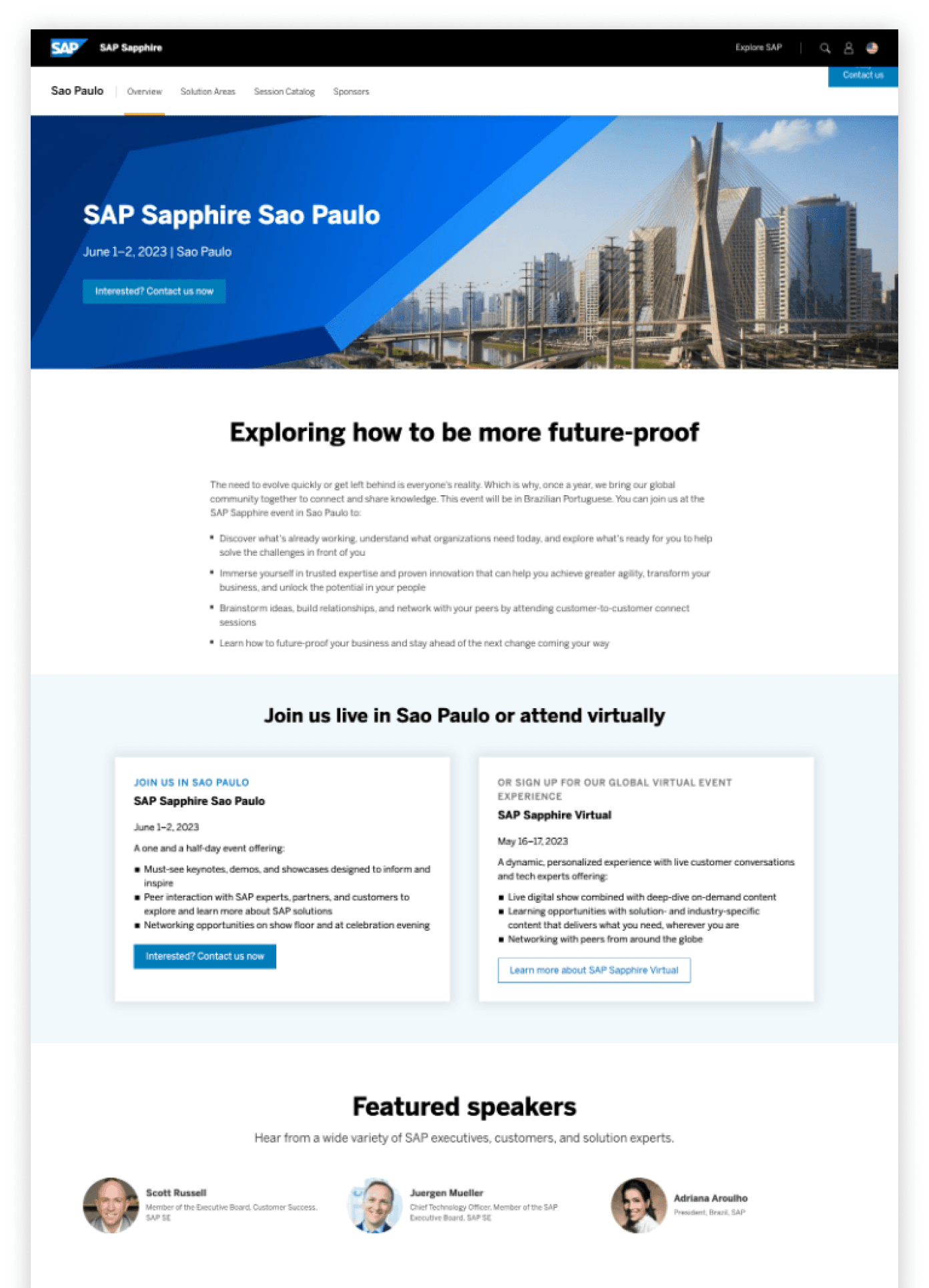
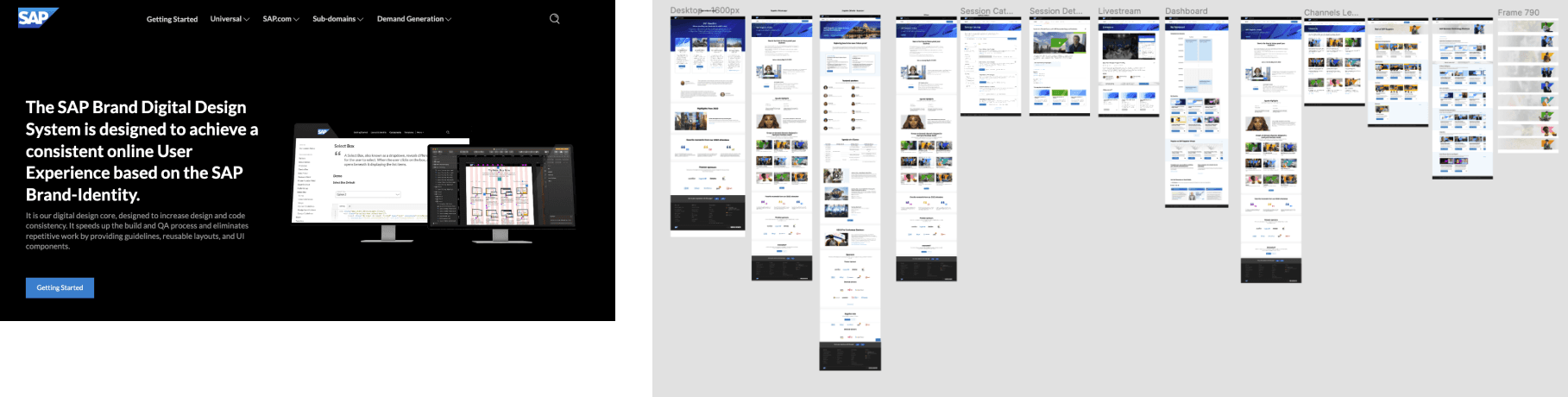
Finalized Hi-fidelity mockups were created in Figma using our SAP Digital Design System. All components/elements in the design system are documented in Frontify are available in our AEM system. For every mockup we created multiple breakpoints: Desktop, Laptop, Tablet portrait, Tablet landscape and Mobile.
——
AEM Platform Virtual Overview
Final Design
Registration CTAs were prominently placed in the Hero. As the user scrolls, the CTAs move to the secondary navigation which is pinned to the top of the page. On mobile, the CTAs appear in the nav and hero

——
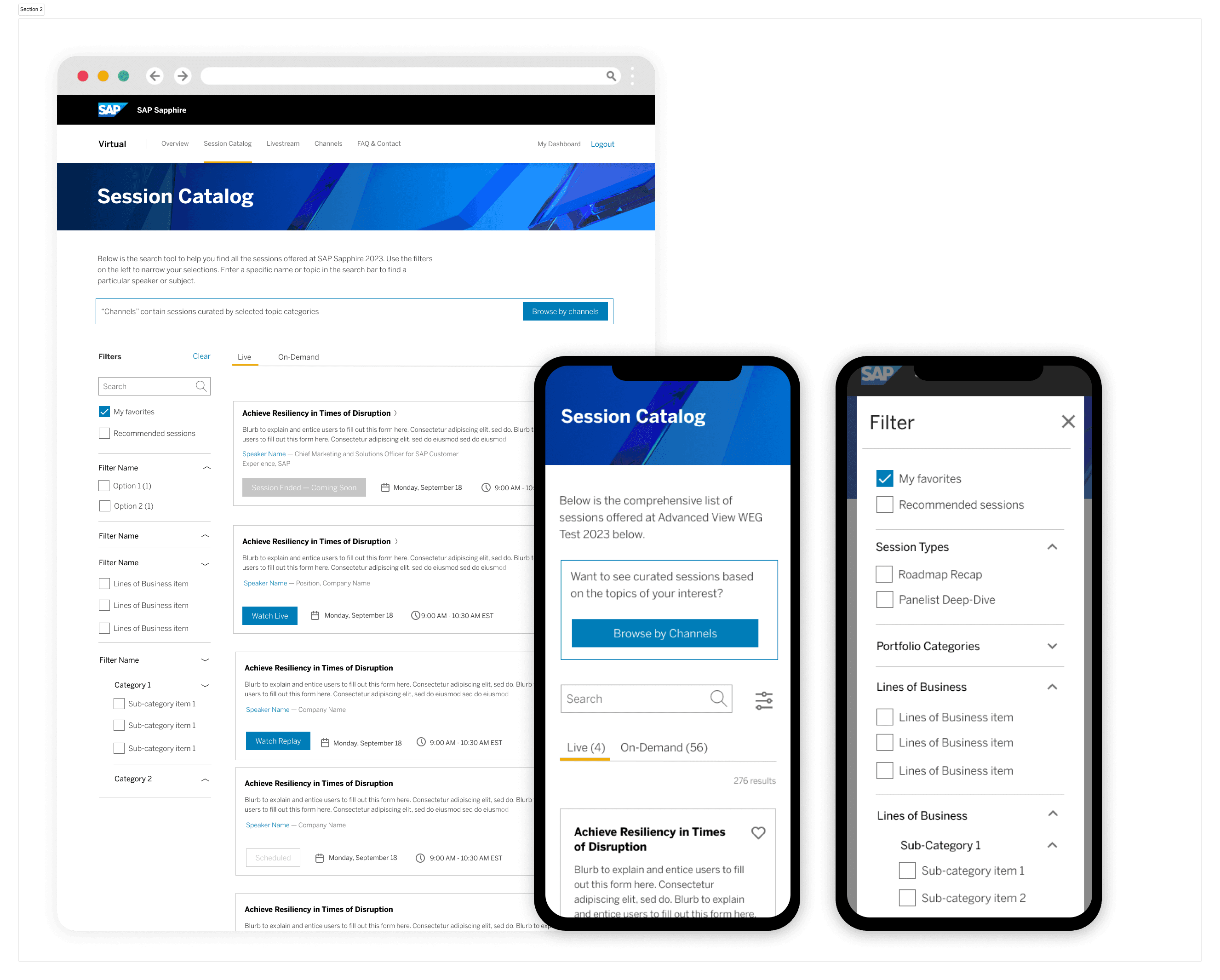
Rainfocus Platform Sapphire Virtual Session Catalog
Final Design
Rainfocus implemented our design system and built pages from the ground up.

FIGMA
AEM COMPONENTS
DESIGN SYSTEM
HIGH-FIDELITY MOCKUPS
VISUAL DESIGN
——
Oversee Designer
Once I finalized the template with the Brand team, I then delivered the template to the graphic designer (on the UX research+dev team). It was their role to create all image renditions and upload to AEM DAM (~20 images). Image and video production at SAP.com requires follows a digital asset management process+guideline for AEM.
Image types included different heroes across 4 event pages. The Rainfocus and WEG and Registration platforms had their own process + image repository.

05
DELIVER
Handoff + Engineering Partnership
Implementation
Making the page designs come to life is the moment of truth (and a bit of chaos!).
Implementation affected 3 different platforms: AEM, Rainfocus and WEG, so we worked closely with these different teams- each with a different processes.
AEM Platform
SAP.com is hosted on the AEM platform. This platform has the highest SEO traffic and most robust components and templates available. We created a new component that supported the various event “experiences” as they become available. Majority of IT communication was done either via JIRA or email or weekly platform <> DX sync.
Rainfocus Platform
Rainfocus was the 3rd party platform that we only use for Virtual Events. We had to communicate the key Design System guidelines like the grid, spacing, typography, colors. Once that was established, we also provided the annotated page designs in all breakpoints. The Freeman Agency development team and SAP team were able to communicate directly in figma, where we would track all communications, questions and any needed design clarifications/updates.signing off for go-live.
UAT
Every page mockup had a separate UAT section in Figma. UAT was a very intensive robust process that included reaching out to specific stakeholders to enter items, communicating to the responsible party to address issues, and following up once the items were complete. We used a shared excel document for tracking purposes, but thankfully we had figma to talk through the solutions with the developers.